HIG-aligned
Components follow Apple Human Interface Guidelines with intentional per-platform behavior.
35 themed SwiftUI components, a layered token system, and macOS + iPhone showcase snapshots — so your app looks native on iPhone, iPad, Mac, Apple TV, Apple Watch, and visionOS.
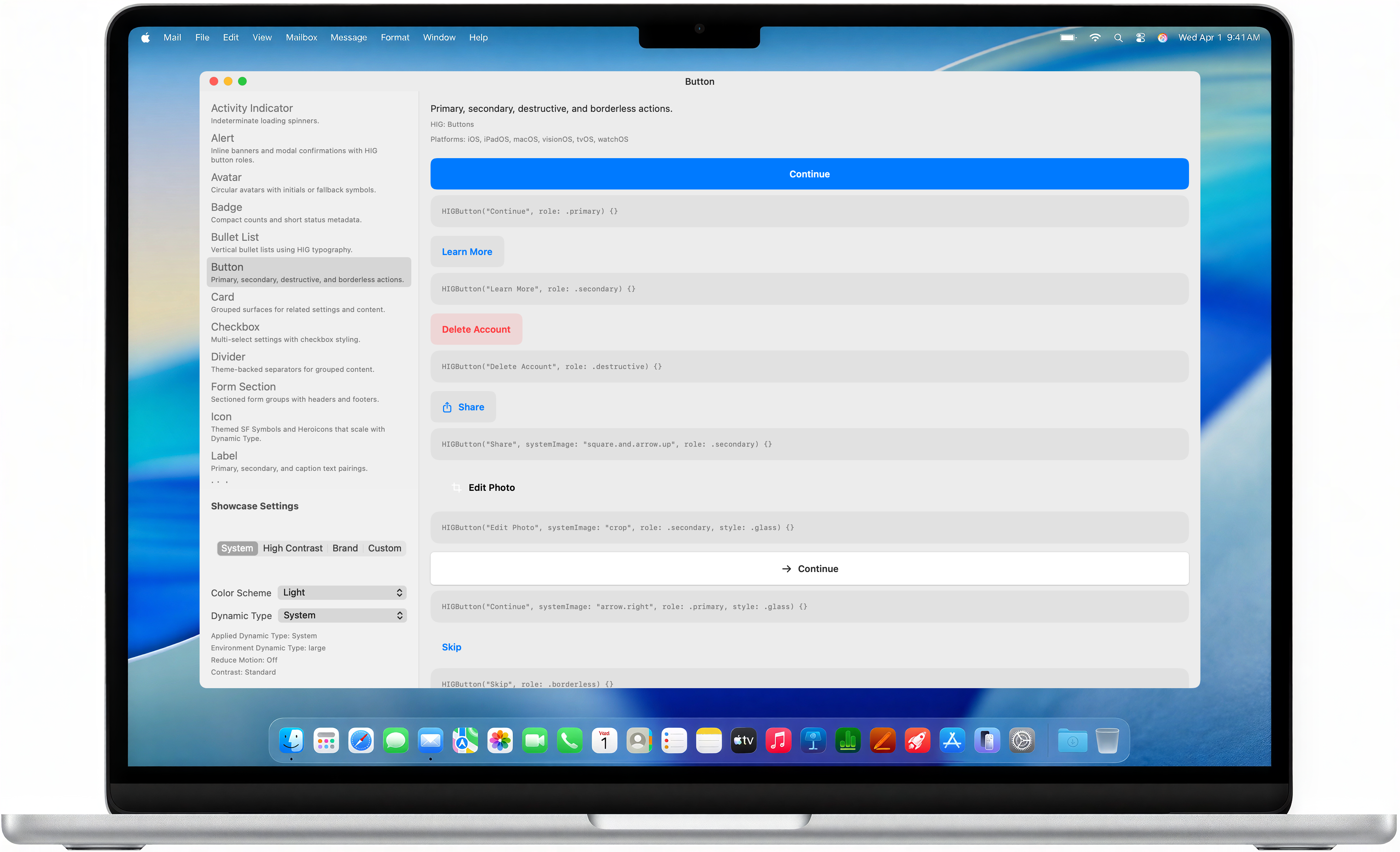
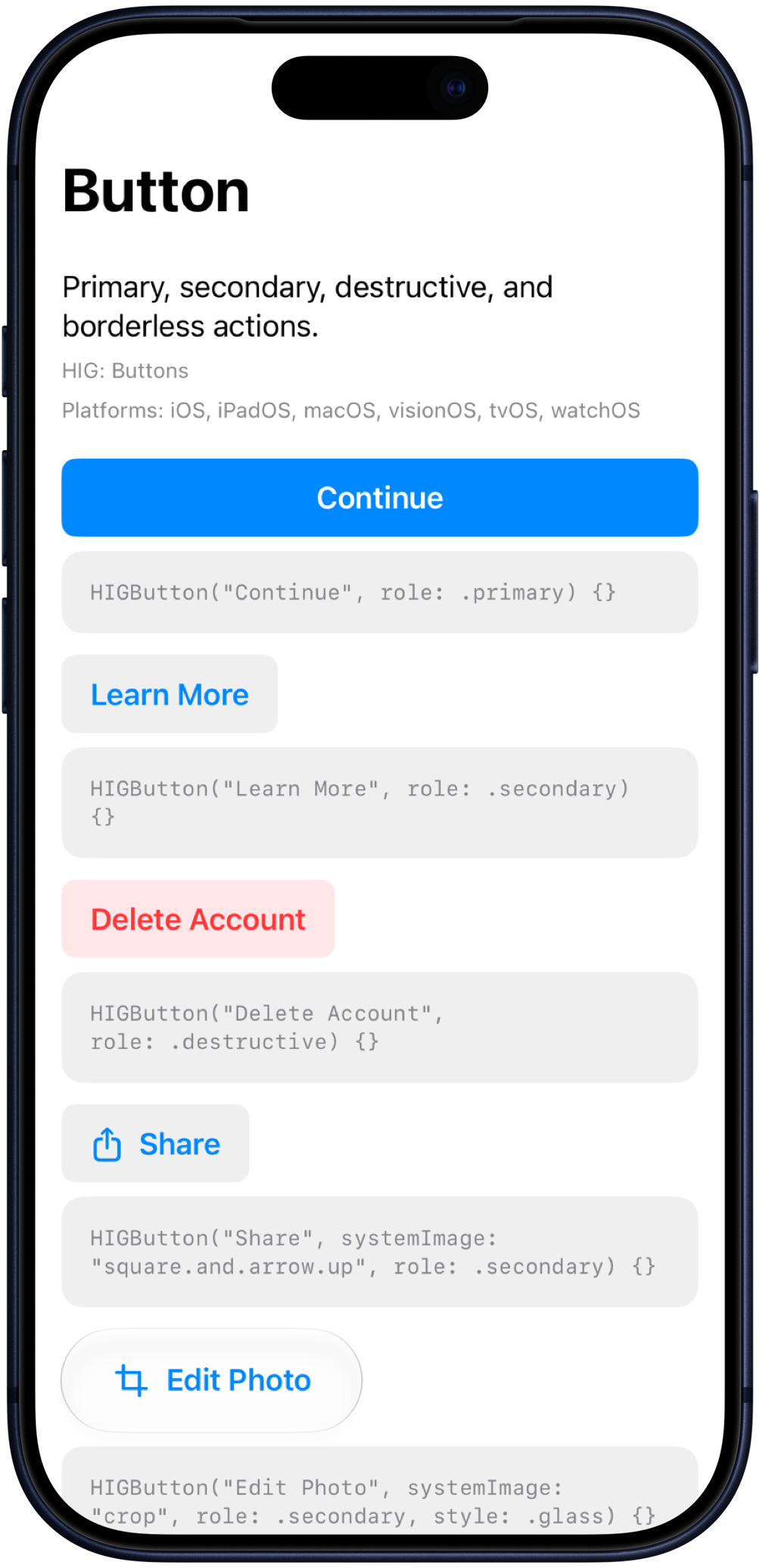
Not a toy UI kit — HIGDesign enforces tokens, documents every public symbol, and ships with verification scripts used in CI.
Components follow Apple Human Interface Guidelines with intentional per-platform behavior.
Wrap once with HIGThemeableView. Swap system, high-contrast, or brand themes instantly.
Raw → semantic → component tokens eliminate magic numbers in view code.
iPhone and Mac showcase renders keep visual regressions visible in PRs.
System theme, light mode, macOS and iPhone showcases. Explore all 35 components in the sample app or DocC catalog.
Add the package in Xcode or Package.swift, then wrap your root view.
// Package.swift
.package(url: "https://github.com/promptdora/HIGDesign.git", from: "1.6.0")

// App.swift
import HIGDesign

HIGThemeableView(theme: HIGSystemTheme()) {
    HIGButton("Continue", role: .primary) { }
}